Looking back at my preliminary task it is clear that my basic understanding for photoshop and using the tools has developed a lot. I also think that when it comes to using adobe photoshop my confidence has grown and I'm willing to try new things and be more inventive with my work as opposed to sticking to my design with no room to change. Everything on my current product is of a better quality then it was on my preliminary task, this is mostly because of the amount of time allowed to be spent on my preliminary task was literally nothing compared to how much has been spent on my magazine.


For my main task I staged a proper photo shoot using a professional quality camera and professional lighting, opposed to taking photos at random locations and intending to cut the background out. The lack of structure and organisation when making my preliminary task contributed to the outcome being reasonably poor. During my preliminary task I didn't add any effects such as drop shadows or bevelling and embossing the text partly because I didn't know how to and partly because there wasn't time to add the final details.
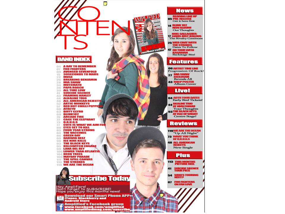
 However when making my final product it was the finer details that I seemed to pay more attention to as they could determine whether the piece of text or image belonged on the particular page. My design sketches were more guidelines and I found that because I had more time I was more relaxed about playing around with the layout of certain pages. When creating my preliminary task it was hard to find inspiration as there aren't many school magazines around. However as the genre of music is so popular and common in magazines all I had to do was research what kind of layout was conventional as well as what type of images I should be looking to use.
 Another thing that I managed to adapt from my preliminary task was a set colour scheme. Although my preliminary task did have a colour scheme of blue and yellow (school colours) it wasn't as strong and consistent as my final product which I think is another aspect which made my piece more successful than the preliminary task.


